Feature Addition
Since launching in 2009, Grindr has grown into the largest social networking app for gay, bi, trans, and queer people. Today, Grindr proudly represents a modern LGBTQ lifestyle that’s expanding into new platforms. From social issues to original content, they are continuing to blaze innovative paths with a meaningful impact for their community.
CHALLENGE: With the growth and user demand for a video chat and augmented reality (AR) feature, I wanted to create a video chat experience that is seamlessly incorporated into its current mobile app to create a more immersive and interactive experiences.
GOAL: To increase user satisfaction by reducing bots and cat-fishing with the development of verification, video, and AR features.
ROLE: as a UX Designer I conducted research, user interviews, usability testing, and created mockups, feature prior, wireframes, and lead prototyping sessions.
DURATION: 2-week sprint
PLATFORM: IOS
TOOLS: Whiteboard, Sketch, InVision, Google Drive, Google Slides, Photoshop, Slack
Research
I first began my own study within the Grindr app. I created a profile, began operating through the app, and took note of its function and capabilities.
Researched on Grindr and their position in the current market. Then conducted further research on possible video and AR features that are currently available in the industry and the industry projected growth and demand.
Conducted interviews from 9 different Grindr users to find out their overall experience with the Grindr app and other dating apps.
User Quotes
C & C Analysis
I first wanted to see how Grindr stacked up against their competitors. From my user interviews who have used other dating apps, I compared the features that they offer as well as the features behind their paywall. By adding a Video Chat and Live Photo feature that other competitors do not offer, we can gain more customer satisfaction and retention.
Synthesize
Affinity Mapping
After gathering quotes and quick notes from my user interviews, I grouped them to find similar traits, behaviors, and problems. With this Affinity Map I was able to understand our users better and prioritize my features.
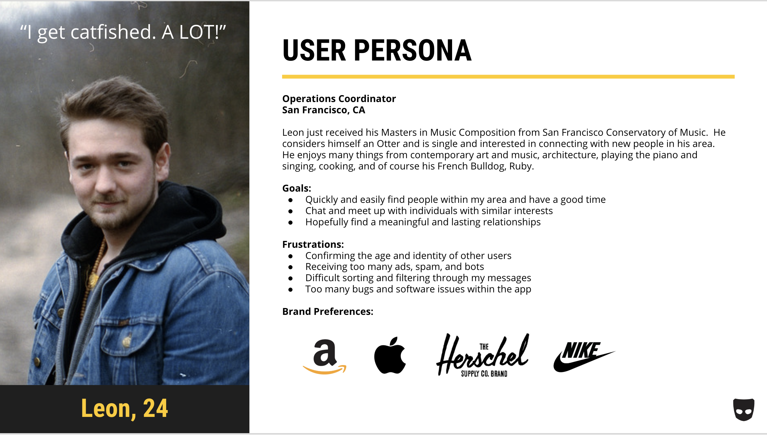
From our interviews I found that there are bigger problems that lie within the Grindr app. Our users expressed frustrations with message and app reliability, cat-fishing, unwanted content and bots. Ultimately, our users want real connections, so I wanted to create a reliable way to verify people’s identity through the app.
Pivot Statement: How can we eliminate or reduce the amount of cat-fishing and bots within the app to produce a more pleasant experience for our users?
To have a better understanding of our users and having a user-centered approach to the problem I created a User Persona. I’d like to introduce Leon (right).
Journey Map
Leon’s Journey Map through the current app showed me his pain points and how I might be able to solve those problems with a user-centered design approach.
I found that bots, spam, ads, and cat-fishing were a major issue with our users.
They were also frustrated with the amount of content they can receive and control.
They also experienced bugs and crashing from the app and having their entire conversation deleted. I hope to work with developers in solving this issue.
This also helped me pivot my problem statement to not just adding new features, but also minimizing cat-fishing and identity fraud.
Revised User Flow
Existing User Flow
The current User Flow through the app shows me where I can add my features, find areas of friction, and visually see the flow of our users.
The Revised User Flow with my new features incorporated helps me to see how our users would apply my new features and see if I can make it more streamlined.
Feature Prioritization
With the growth and demand for AR features, I initially planned to incorporate this new feature in the app as a more fun and interactive way for our users to connect with each other. However, I conducted another set of interviews for Feature Prioritization and found that our users were uncertain and skeptical of what this new AR feature would entail, or they either did not care much for it and preferred a video chat feature instead.
With our users in mind, I wanted to implement essential features, so I decided to go with Video Chat, Live Photo, and Account Verification features for a more safe and secure experience.
Ideation
Initial Sketches and Wireframes
These low-fidelity sketches gave me the idea and blueprint I wanted to take in developing my features and design within the app.
From those sketches, I created mid-fidelity wireframes which helped me to visualize the functionality, flow, and design layout of my new features.
Hi-Fidelity Wireframes
Account Verification
This verification process is to confirm for other users that you are not a bot, and users can have more connections with real people. Users must copy the gesture shown and snap a photo. The photo is not used for anything but verification and will not be posted anywhere. Once the photos match the user can follow through to completion and begin using the app normally.
Photo + Video Chat Feature
When starting a chat, notice certain features such as video and group messages are not available until a response has been given. This is to minimize the amount of unwanted messages and calls user received.
The Live Photo question mark icons indicates that the picture was not taken through the Grindr app camera and unable to identify the photos source. While the check mark icon represents the photo was taken live through the Grindr app.
The video chat feature will prompt a message to confirm the video call. Once the other user accepts and answers the call, users can flip the camera, mute audio, or go back to messages without ending the call. Ultimately, these features are to verify each others identity and proceed to meet up safely.
Design Review
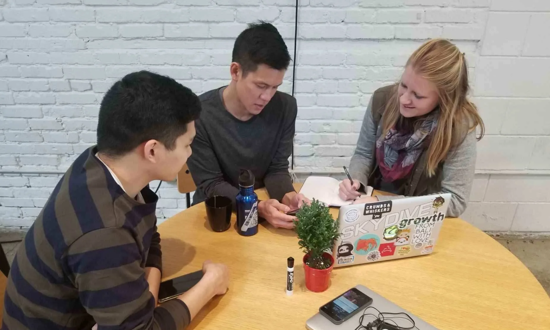
By creating a paper wireflow to show how the new features would be implemented and used, I had a Design Review and posted it up on a wall for comments and review. I found that our users enjoyed our new features because of its easy and streamline usage, but also got feedback for iterations to be made.
Usability Testing
During my Usability Testing of 15 users, I discovered that all our users had an issue with the profile placement and got confused. However, further interviews showed that with actual Grindr users they were use to its placement, and that its was a normal layout even with that of other dating apps. With the review and testing I continued our design iterations to finalize a hi-fidelity prototype.
Next Steps
Prototype
To learn more about this project, contact me at allenjsuh@gmail.com


