Client Project + e-Commerce Redesign
Birthed in the aftermath of Trump’s election, Lipslut is a grassroots cosmetics brand that integrates activism and beauty. They create viral products that drive political discourse, and fight back by donating 50% of earning to worthy causes. Lipslut empowers women one face at a time.
CHALLENGE: Lipslut is in the process of migrating their business onto a new platform, Shopify. During the rebuild, Lipslut would like to rethink the new website’s user experience and design by improving selected KPI’s - conversion rates, cart abandonment rates, and repurchase rates.
GOAL: To redesign Lipslut’s website and e-commerce platform to improve the selected KPI’s by creating a friendly user flow through intuitive navigation, transparency of brand, and greater inclusivity.
TEAM: Allen Suh, Chandler Johns, Lauryn Whitney, Danielle Kamens
ROLE: as a UX Designer I conducted research, user interviews, user flow testing, usability testing, card sorting, created the site maps, heuristics, and c&c analysis and lead design studio sessions of sketches, mockups, wireframes, and interactive prototypes.
DURATION: 3-week sprint
PLATFORM: Desktop
TOOLS: Whiteboard, Sketch, InVision, Figma, Photoshop, Illustrator, Slack, Trello
Design Process
Research
I sat down with the Founders of Lipslut, Katie Sones and Ken Grodin, and discussed company history, brand image, expectations, my goals and preliminary scope. As I got to know more about the Company and the Founders, I did some research on their selected KPI’s for improvement: conversion rates, cart abandonment rates, and repurchase rates.
By first creating a Brand Identity Assessment guideline helped me give an understanding and continuity of the tone and message I want to display throughout this process, which was obtained from the current company’s color, style, and typography.
Heuristic Evaluation
C&C Analysis
I compared direct and indirect competitors of Lipslut in the cosmetic industry. By reviewing the design layout and features, I was able to see areas where Lipslut had done great and areas where they can improve. Specifically, having images and models represent different skin tones and complexions and customer sharing and review.
Evaluating the current website of Lipslut and categorizing certain Heuristic Violations gave me an initial ideas for areas of improvement.
I conducted 7 user Interviews and 12 User Flow testing of Lipslut’s current site with women who are online shoppers, politically aware, and/or make-up enthusiast. Then synthesizing my findings into an Affinity Map, I gained key insights from our users and a greater problem with the Lipslut brand, which was inclusiveness.
From my affinity map findings, our users emphasized their needs and frustrations to help me to create a Feature Prioritization map to implement into the redesign.
User Persona
I created three User Personas for Lipslut. Maddi and Kim are current and new users that we want to retain. However, I want to focus our design approach centered around Shae (right), who is a user that currently feels excluded and not represented with the Lipslut brand.
Problem Statement: How might we create a website where users feel clarity, inclusivity, and transparency while they’re spending their dollar to fight against the current sociopolitical issues?
User Quote
“ I won’t give money to an experience I’m not included in or I have to wait for. It’s 2019 and if you haven’t caught on to what you can do to be more inclusive, I’m not waiting around for you.”
Customer Journey Map
Observing Shae’s Journey Map through the website, I was able to see clear pain points and areas of opportunities to tackle these frustrations from our users.
Ideation
Starting the design process, I first created a Site Map of the existing website. Emphasized by our users, it is clear to see the navigation issues. “F*CK Trump” and “F*CK Kavanaugh” are predominately visible within the landing page and navigation making our users assume Lipslut only has two products. They were uncertain of what “Lipslut Lab” was and what “More” contained as well.
In this Revised Site Map, I have categorized all products under “Shop” and relevant information about the company within the main navigation. To clarify the products, we also separated the “F*CK Series” as the charitable products and “Lipslut Lab Series” and others as non-charitable below. Users also emphasized a need to view all products Lipslut has available, and so we created a page for that.
Meeting again with the Founders of Lipslut, I had a Design Studio session where I discussed our findings and collaborated on ideas. We sketched lo-fidelity wireframes of the redesigned layout and structure of the site. During this process I wanted to tackle three issues within our redesign.
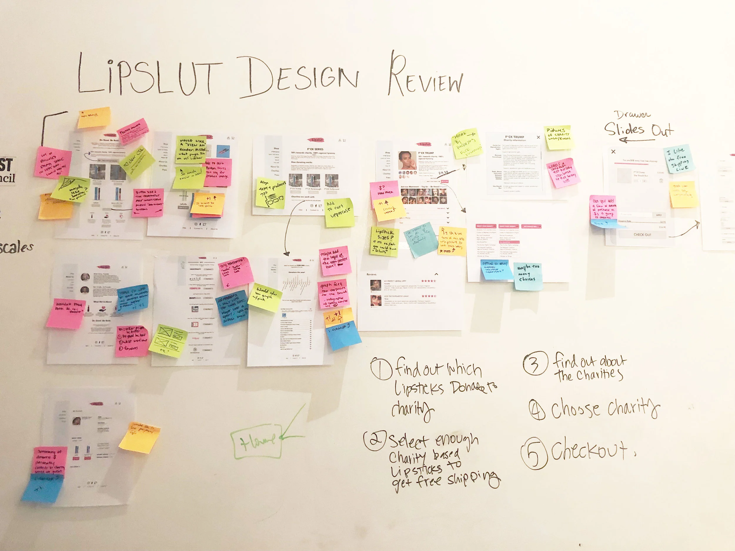
Then creating mid-fidelity wireframes, I had a Design Review with designers and non-designers alike and gained great feedback to make iterations and begin my prototyping and usability testing phase.
Design Iterations
Interaction Designs
Created interactive designs within the website which includes buttons, overlays, pop-ups, animations, error messages, gamification shopping cart, and charity selection and information for a more live and immersive experience.
Prototype
Next Steps
Refine the community engagement
Iterate site design with A/B Testing
Implement user survey needs
Revise of logo with white font
More inclusivity in design and product colors
Making all items charitable so your mission
is aligned with your business practices
To learn more about this project, contact me at allenjsuh@gmail.com


